ED.gov
Student Project: Responsive Website Redesign for ED.gov. Conducted first two phases of design process with 2 other student UX designers in An Agile Setting. Final design stages were done independently.
.png)
The U.S. Department of education is big - really, really big. It serves over 50 million K-12 students, along with millions more post secondary students, educators and family members. Its budget is over $68 billion, and there are 15 huge sub-departments within the Department of Education. Its size is both a strength and an obstacle, causing difficulties for users trying to navigate ED.gov.

Due to overwhelming visual heuristics and confusing usability heuristics, users have difficulty finding needed resources on ED.gov, leading to frustration when users visit the site.
Ease of Navegation: Prior to redesign, given 4 common user tasks, 100% of users failed 1-2 tasks, and took an average of 2 minutes on tasks they completed. After the redeisgn, 90% of users passed all tasks, and took an average of 20 seconds to completed tasks.
We began our research by conducting a Heuristic Evaluation Checklist finding many issues with the appearance and aesthetics including: lack of white space, hover issues, and color inconsistency. We also annotated the homepages navigation (Left Image Below) finding the main navigation confusing and redundant in places. Finally, we conducted Red Lining (Right Image Below) of the homepage’s visual heuristics.
%201.png)
%201.png)
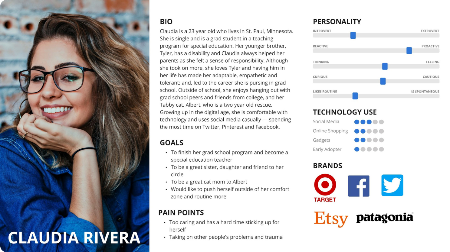
We then created a proto persona - someone who might visit the Department of Education website for various reasons. We chose to create Claudia Rivera for this process - a 23 year old teacher in training who might visit the site for assignments in her teacher prep program, or as a post-secondary student looking into student loans, or as a student teacher trying to find resources for students and their families.
We created 4 User Paths Claudia may take, due to to the wide number of reasons a teacher in training may visit ED.gov..
Find Answers to Basic Education FAQ’s about 504

Find A Fact Sheet on the ESSA Law
.png)
Find the Teacher Loan Forgiveness Info Page
.png)
Find Any Data on High School Graduation Rates
.png)
With our user paths defined, we tested 9 users total (the majority of whom were teachers) to see strengths and pain points users might have navigating the current ED.gov site. We gave the users 4 tasks, that matched our 4 user paths. After an initial testing round of 5 users - we found users went straight to the search bar to pass our tests, as they could not understand the navigation. So - we conducted a second round of tests with 4 more users and updated our tests - leading to 9 total user tests.


We typed up our User Testing notes on note cards in Miro, highlighted some key quotes, and then sorted all of our notes into an affinity diagram. The data corroborated our hypothesis about the site navigation and heuristics.
%201.png)
%201.png)
The US Department of Education is committed to developing innovative educational solutions to empower students, educators, and institutions nationwide. Supporting students from K-12 to higher education and their families.
We're better because we are one ofthe largest educaiton systems in the world, with a long-standing track record of shaping education policies, funding programs, and driving research initiatives that have a tangible impact on the education landscape globablly. With our extensive network of educators, researchers, and policymakers, we bring together the brightest minds to collaboratively address the evolving needs of the education sector.
We're believable because our impact is visible in the countless success stories of students who have benefited from our programs, improved graduation rates, and increased educational opportunities. Our secret sauce lies in our commitment to data-driven decision-making, continuous improvement, and our dedication to fostering an inclusive, equitable, and accessible education system for all Americans.
Usability testing helped us prioritize major changes to the ED.gov homepage. One major shift needed to take place was the Information Architecture of ED.gov. While up to this point we had worked as a team, we now began our individual design process. While I would have preferred to have users card sort categories for ED.gov, our assignment was to card sort as individual designers. My card sorting process involved the following:
I listed 79 links from the home page, and 112 links from all secondary pages.
%20(7).jpg)
From my initial 191 links, I created 10 new categories for the new homepage.
%20(6).jpg)
I prioritized secondary & tertiary links, deleted duplicates & put links into hierarchical orders. I reduced my list of 10 categories to 5 primary categories, 3 footer categories, & utilities.
%20(8).jpg)
Finally, I iterated my list of 5 primary categories, solidifying secondary & tertiary links to assign in my site map.
%20(9).jpg)

To find inspiration for a new User Interface - I created a mood board in InVision. I used some of this mood board as a pseudo competitor analysis - for example, I added screen shots of homepages for departments of education from other countries around the world with highly successful education systems, as well as some of the largest education curriculum companies in the world. I also pulled from websites with strong navigation systems for search functions like Unsplash (as many of our users relied on the search function), and media articles - like The Atlantic.

I created a new Style Tile and Full Style Guide for ED.gov. To help choose colors and fonts, I used the brand voice and identity my group created for ED.gov. This voice and identity included adjectives like Bold, Cooperative, Leadership and Innovation. With these adjectives in mind I updated visual aspects like the color, keeping the hue blue, but choosing more bold shades and changing the font to embody innovation.

I began with Sketches and Lo-Fidelity Prototypes in Figma (pictured below)

.gif)
As we were designing for Responsive Web Design, we focused our initial designs on mobile, while also keeping desktop in mind (pictured above). During our mobile first approach, I developed two navigation systems specific for mobile:
A - With a popout modal menu, with search bar in top bar.
B - With a push down menu containing search bar.
The results were clear; version B with the push down menu was easier for users to see and more visually pleasing.
.gif)
 Link to Clickable Prototype in Figma
 Link to Clickable Prototype in Figma
I would have preferred to have users conduct the card sorting, though this was not part of our class task.. IF Ihad done this, I would have paired down the number of cards Igave users, and given some more strict perameters.
More User Tests: One secondary page I created was a “parents/teachers” drop down. I would have loved to try to build this out with current content that falls into these buckets on the website and then test this new drop down with teachers & parents to see if it really would be valuable for users of this website, as my hunch tells me it would.
I would also want to test the new primary navigation links more extensively. Would users like the combined Loans & Grants primary category? Would users use the “About Us” section as intended?
Finish Building Out Secondary Pages
Stakeholder Feedback: I would have loved to have taken this too the Department of Ed, and gotten therefeedback, and more information about the difficulties I am sure they have as a HUGE organization to create consistancy and conduct changes.

